Smite Services.
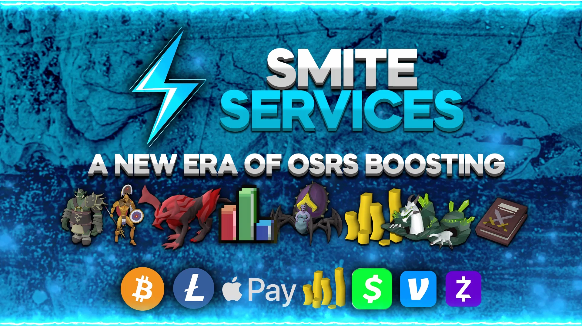
The original blue lightning identity, animated banner and connected service campaigns.
The visual direction.
A coordinated Smite Services client project. The original blue lightning identity, animated banner and connected service campaigns. Graphic design and animation by Omar / Smite Studio.
Colour palette and presentation finish developed from the original artwork.
The color and type system.
#36C9EEElectric blue#167ACFDeep navy#071A2ASilver#D8E6F0Ice white#F3FAFFArial / bold & regular — Supporting typography for this portfolio presentation. The original client wordmarks and lettering remain intact.
The complete identity presentation.

Original artwork and applications.

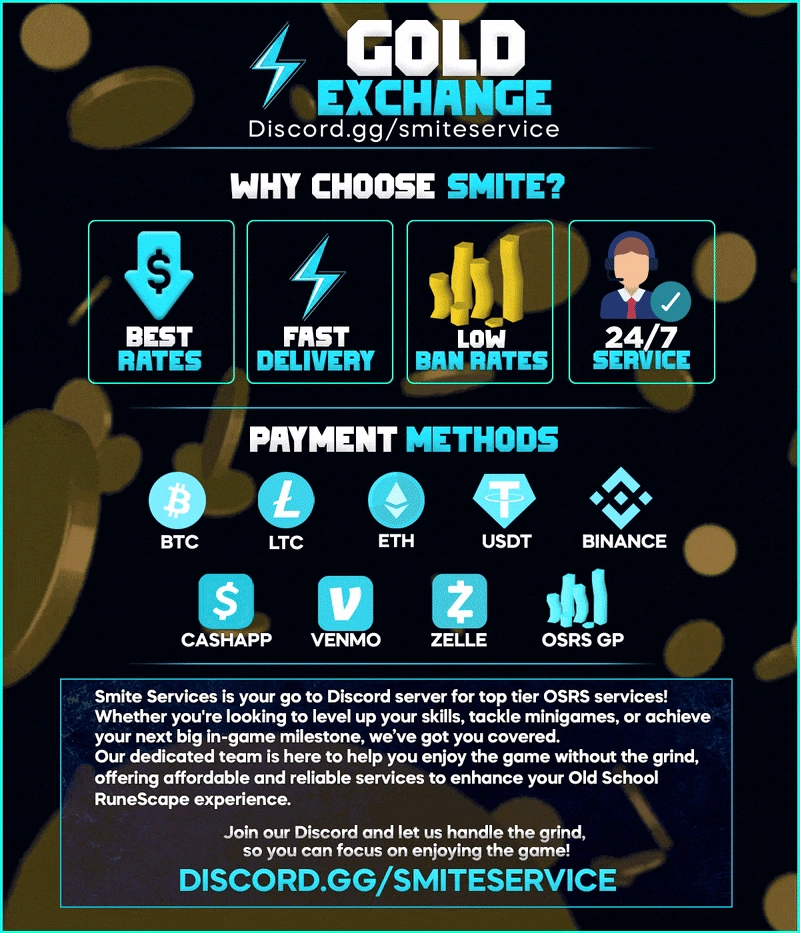
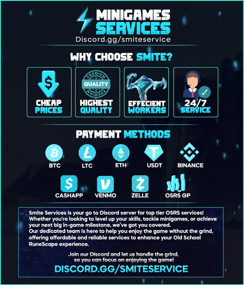
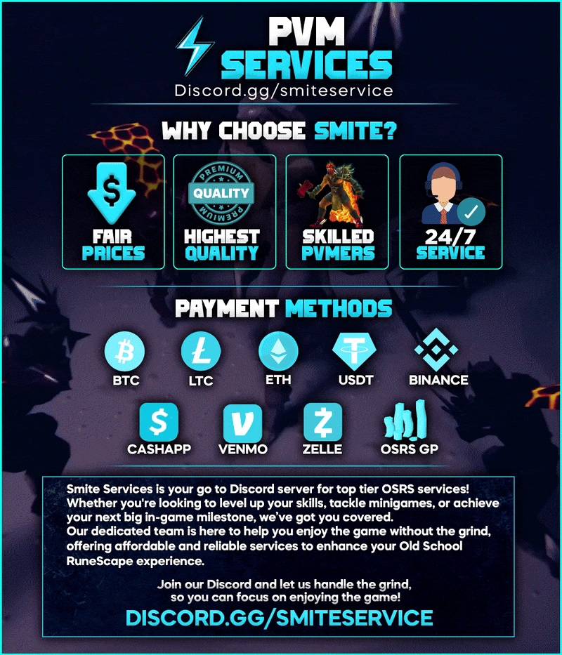
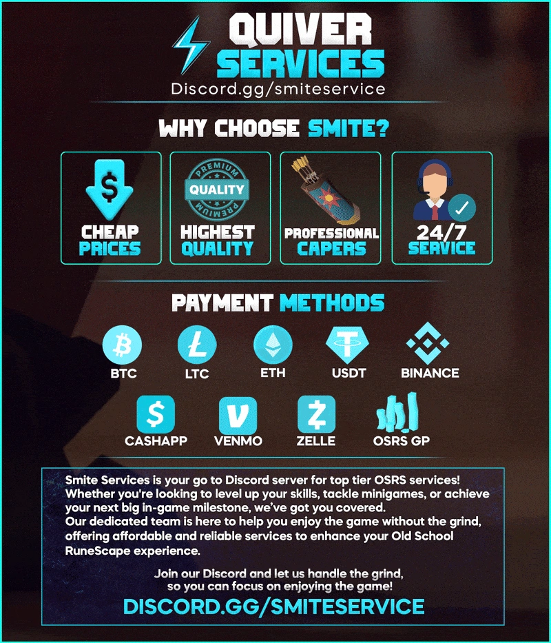
Smite Services. One connected visual system.
A coordinated Smite Services client project. The original blue lightning identity, animated banner and connected service campaigns.
The project.
Smite Services is a complete client design selection from Omar’s original archive. The case brings the identity, motion and matching applications together.
Omar’s work.
Graphic design, layout and animation across the matching client assets shown.
Why it feels connected.
An identity with a clear anchor
The original mark or character is repeated across the banner, smaller identity and matching applications so the project reads as one brand.
Colour with a consistent finish
The palette follows the original artwork. A small lift in midtones, saturation and edge clarity prepares the presentation copies while retaining the original hues.
Layouts shaped for their placements
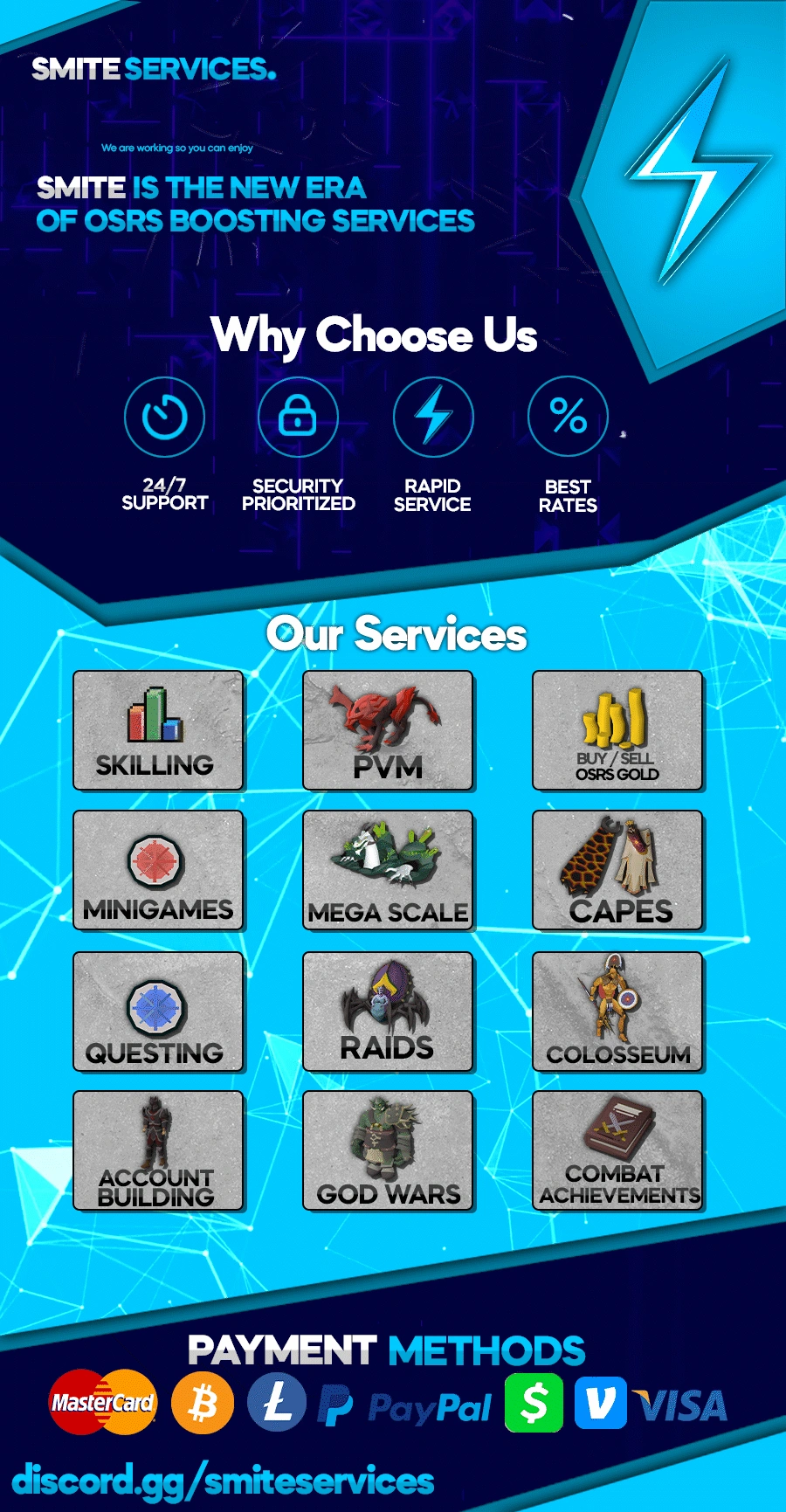
Wide banners, compact identities and longer service artwork keep their original purpose and proportions. The complete case shows the connected formats together.
The work, in use.
- Animated brand banner
- Lightning symbol
- Complete service thread
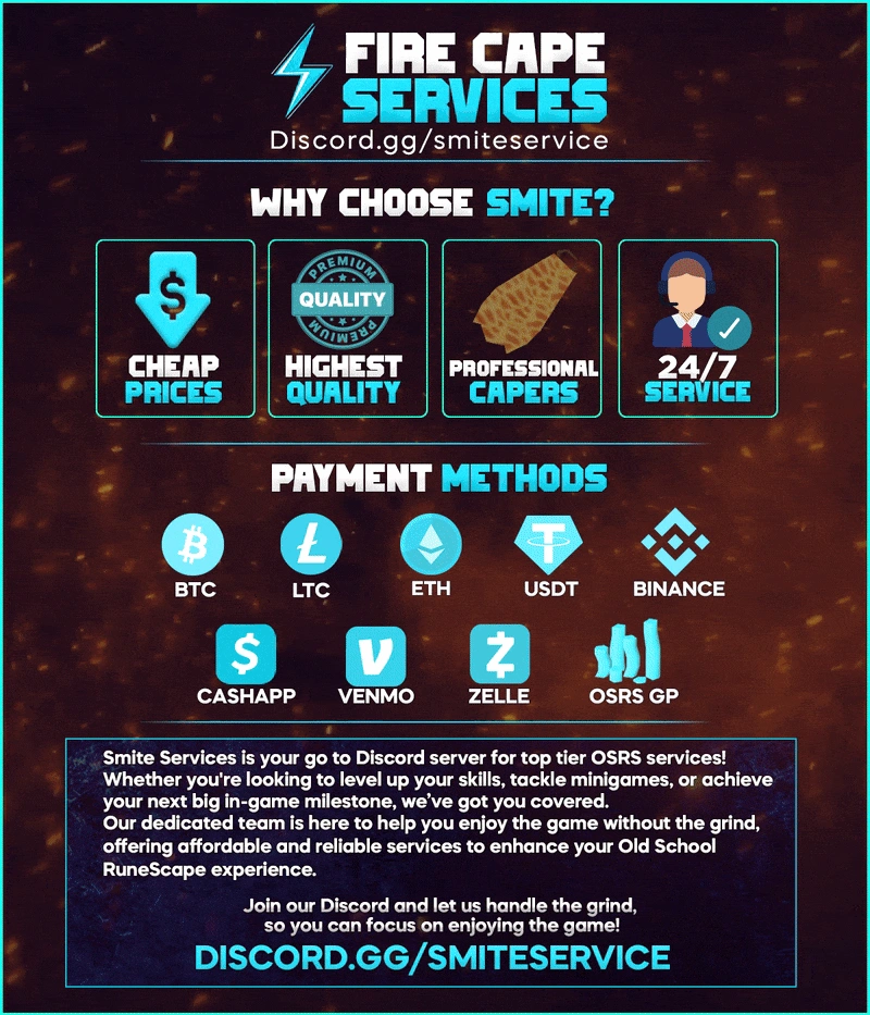
- Fire Cape campaign
- Gold campaign
- Minigames campaign
- PVM campaign
- Quiver campaign
A connected identity for your next project.
Explore brand identity design or Discord graphics and animated avatars, then send the scope you have in mind.